There’s something deeply comforting about stepping into a home that instantly feels calm. Not sterile or overly curated, but quietly elegant. That’s exactly what the atmosphere of biscuit beige delivers. This understated neutral is fast becoming a favourite among designers who favour a refined yet lived-in look, often described as “quiet luxury”. It’s soft, warm, and versatile, creating interiors that feel timeless without being bland.
Unlike the cooler greys that dominated the last decade, biscuit beige carries a gentle warmth that flatters natural light and softens sharp architectural lines. It pairs beautifully with contemporary minimalism, rustic textures, or the plush layers of modern classic design, making it one of the most adaptable shades of the moment.
What Exactly is Biscuit Beige?
Biscuit beige sits between a sandy taupe and a creamy oatmeal; it’s less yellow than traditional beige, but warmer than stone or greige. Its name evokes a subtle sweetness: the golden, buttery tone of freshly baked biscuits. It’s this balance of warmth and neutrality that makes it so effortlessly liveable.
When used on walls, biscuit beige creates a cocooning effect that works equally well in open-plan living spaces and small, intimate rooms. It complements a variety of flooring options, from pale oak planks to soft limestone tiles, without competing for attention. It’s also a forgiving shade, meaning it’s less likely to look flat or cold under changing daylight than cooler neutrals.
Why It’s Everywhere Right Now
The appeal of biscuit beige lies not only in its aesthetic charm but also in its emotional resonance. After years of bold colour experiments and cool minimalism, many homeowners are craving interiors that feel grounded and comforting. The “quiet luxury” movement, defined by restraint, craftsmanship, and natural materials, has pushed this shift further, replacing showy glamour with subtle sophistication.
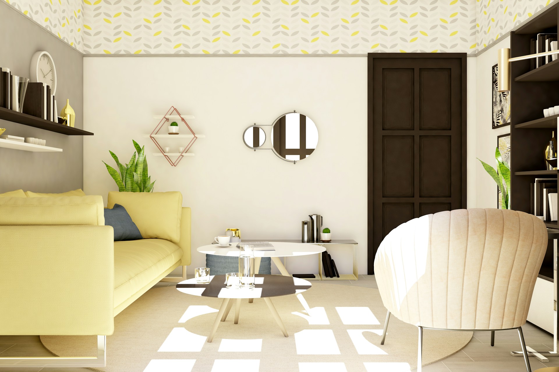
Biscuit beige perfectly embodies that mindset. It’s approachable yet aspirational, suggesting a sense of warmth and quality without shouting about it. Designers love how it harmonises with tactile materials such as boucle, linen, and wool, as well as brushed brass or matte black accents. A biscuit-toned living room with linen curtains, warm beige walls, and warm parquet flooring instantly feels serene and luxurious, but never loud.
How to Use Biscuit Beige at Home
Start with Your Base Layers: Paint walls in biscuit beige for a calm, cohesive backdrop. Layer it with slightly lighter or darker tones in furnishings to add depth; think almond, stone, and taupe cushions on a biscuit sofa. On the floor, a natural jute rug or light herringbone flooring can enhance the warmth without overpowering the palette.
Mix in Natural Textures: This neutral thrives alongside organic materials. Pair it with soft wool throws, linen upholstery, and smooth timber finishes. The interplay between matte and tactile surfaces keeps the space visually interesting even in a restricted colour palette.
Add Contrast with Accents: Although biscuit beige is subtle, it benefits from a few contrasting touches. Black-framed artwork, bronze fittings, or deep walnut furniture can add structure. For a softer look, consider sage green ceramics, terracotta planters, or chalky white lampshades. These gentle accents preserve the calmness while avoiding monotony.
Layer with Lighting: Warm lighting brings biscuit beige to life. Soft white bulbs or shaded lamps accentuate the golden undertones, while candles and wall sconces enhance its cosy, evening glow. In daylight, it reflects sunlight beautifully, making spaces feel open and welcoming.
The Lifestyle Effect
Beyond aesthetics, biscuit beige creates a certain mood: restful, grounded, and quietly confident. It’s ideal for those who prefer interiors that soothe rather than stimulate. Its versatility also makes it an excellent backdrop for evolving tastes; seasonal décor, artwork, or patterned textiles can be introduced without disrupting the balance.
Psychologically, the colour’s warmth evokes feelings of comfort and connection, making it perfect for shared spaces such as living rooms and kitchens. It’s also a strong choice for bedrooms, where its soft undertones promote relaxation.
Is Biscuit Beige Worth the Hype?
In a design landscape that increasingly values authenticity and calm over excess, biscuit beige feels like a natural evolution. It celebrates softness and subtlety, aligning perfectly with the way people want their homes to feel: peaceful, tactile, and timeless.
Whether used as a dominant hue or a neutral anchor, biscuit beige offers sophistication without effort. It’s not just a colour trend, but a reflection of a broader lifestyle shift towards warmth, restraint, and enduring comfort. It’s the quiet side of luxury that never goes out of style.
For more, visit Pure Magazine