

Making smart financial decisions can feel like solving a puzzle without all the pieces. Studies show that people process visual data 60,000 times faster than text. This blog will demonstrate how data visualization transforms numbers into clear stories for better decision-making.
Prepared to view finance from a fresh perspective?
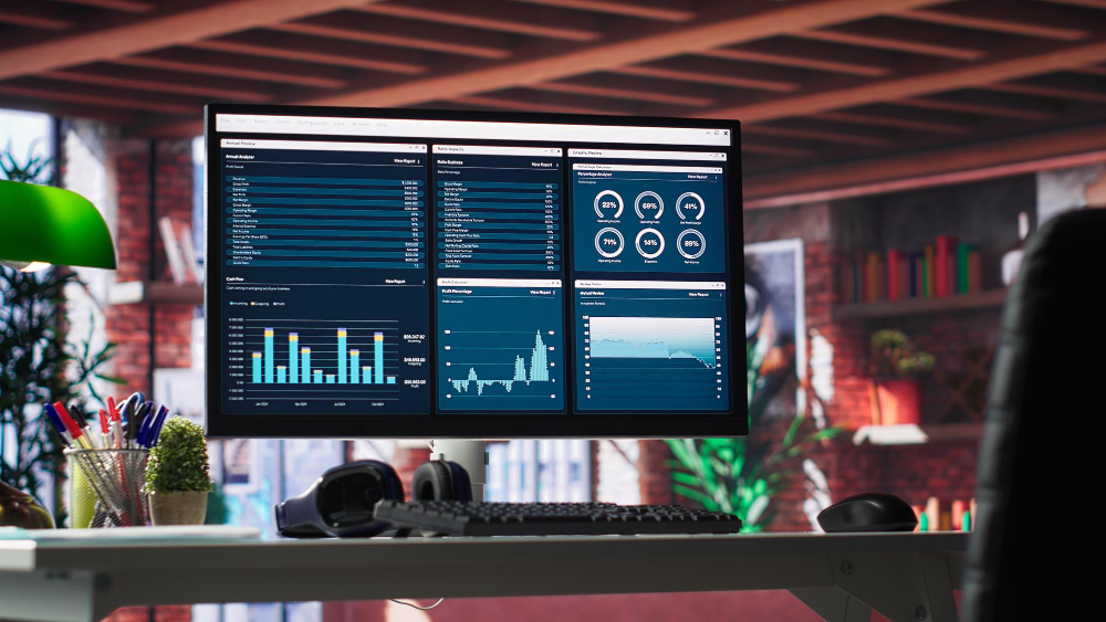
Why Data Visualization is Crucial in Financial Decision-Making
Clear visuals make complex financial data easier to understand. Charts, graphs, and dashboards present information in ways that help traders act quickly. A sea of numbers can overwhelm the sharpest minds, but visual analytics provide clarity when stakes are high.
A picture is worth a thousand words—and this holds true for trading decisions, said every successful strategist ever.
Spotting trends early allows investors to predict market shifts or detect risks before they escalate. Whether analyzing stock performance or assessing portfolio risk, well-designed data representation turns raw insights into smarter choices faster than spreadsheets alone.
Key Benefits of Data Visualization in Finance
Clear visuals make financial analysis less overwhelming. Seeing data patterns can spark faster, smarter decisions.
Simplifies Complex Financial Data
Graphs and charts simplify overwhelming numbers into easy-to-understand visuals. Traders can quickly understand profits, losses, or market performance without going through endless spreadsheets.
Colors and shapes emphasize key figures, saving time on analysis. Dashboard reporting tools present information like revenue growth or risk percentages side by side for immediate clarity.
Complex formulas now appear more approachable in such organized formats.
Identifies Trends and Patterns
Good data visualization turns raw financial analytics into clear patterns. Traders can identify recurring trends, such as seasonal stock price movements or market shifts during economic reports. Techniques like reading the stock market tape also rely on visual cues to interpret real-time price and volume data, helping traders confirm momentum or spot early signs of market reversals.
These visuals present relationships that may remain unnoticed in spreadsheets alone.
Line charts and heat maps often draw attention to changes in performance metrics over time. For example, they might display repeated dips in profits after product launches or increases before quarter-end deadlines.
Visual tools allow traders to make well-informed insights quickly without second-guessing large datasets.
Visualization gives us the ability to see what lies beneath numbers.
Enhances Speed and Accuracy of Decisions
Graphs and charts simplify data interpretation, assisting traders in making quick decisions. A well-constructed dashboard emphasizes key performance indicators immediately, reducing analysis time.
Trends in financial analytics become clear with visuals, minimizing uncertainty. Data visualization tools remove complexity by providing clear insights for accurate actions.
Reduces Errors in Analysis
Data visualization helps identify mistakes in financial analysis more quickly. Charts and graphs emphasize inconsistencies that raw numbers might conceal. For instance, mismatched data entries or incorrect trends become more apparent in visual formats.
This lowers the likelihood of relying on inaccurate information for critical decisions.
Visual representation also supports error detection during quick reviews. Interactive dashboards enable traders to compare multiple datasets simultaneously. Anomalies stand out more clearly compared to spreadsheet reviews.
Clear visuals contribute to more accurate financial reporting and better adjustments while saving time.
Applications of Data Visualization in Finance
Smart visuals turn numbers into stories that anyone can easily understand. They support decisions by revealing the subtle details buried in extensive financial data.
Investment Analysis and Decisions
Traders rely on visual analytics to simplify investment choices. Charts and graphs can clarify performance measurements, making the data easier to understand. For example, a heatmap may emphasize underperforming stocks in real-time.
This helps investors act quickly based on trends.
Trend analysis tools identify patterns that predict future outcomes. Historical stock price charts or moving averages guide decision-making by showing consistent growth or decline over time.
With data visualization, risks become clearer and decisions more informed.
Risk Assessment and Mitigation
Visual analytics helps detect financial risks efficiently. Charts and graphs emphasize irregularities that spreadsheets may obscure. For example, a sudden increase in expenses or declining revenue trends becomes immediately apparent with proper data representation.
Heatmaps and dashboards identify critical risk areas in portfolios. This allows traders to modify investments before losses accumulate. By recognizing vulnerabilities early, businesses can plan countermeasures effectively for improved financial stability.
Budgeting and Forecasting
Effective risk assessment lays the groundwork for accurate budgeting and forecasting. By using data visualization, traders can simplify financial analytics into easy-to-understand insights.
Charts and graphs present revenue trends, expense patterns, and cash flow projections clearly.
This clarity supports informed planning by identifying gaps or inconsistencies in spending or saving behavior. Visual dashboards emphasize potential savings or areas needing adjustment for future forecasts.
With real-time updates, decision-makers respond quickly to market changes without second-guessing their financial strategies.
Performance Monitoring
Traders monitor performance statistics to assess the effectiveness of financial strategies. Data representation aids by displaying these statistics in clear charts, graphs, and dashboards.
These tools make it easier to compare actual outcomes to targets or standards.
Clear visual analytics can bring attention to underperforming assets or investment opportunities. Trends that might be overlooked in spreadsheets become noticeable with effective data representation.
Quick insights from these tools allow for faster adjustments to achieve goals more efficiently.
Tools and Technologies for Data Visualization in Finance
Data visualization tools simplify financial decision-making for both beginners and advanced traders. These technologies turn raw data into clear, practical insights.
- Tableau
This platform converts complex financial data into interactive dashboards. It supports trend analysis and helps track performance metrics easily. - Microsoft Power BI
Power BI creates detailed reports for financial forecasting. Its AI features also assist in identifying critical risks quickly. - Google Data Studio
This free tool integrates with multiple platforms to produce clear visual analytics. It works well for budgeting and financial reporting needs. - Python Libraries (Matplotlib, Seaborn)
These libraries allow developers to build custom visualizations for finance. They are ideal for predictive modeling and data interpretation projects. - Qlik Sense
With its drag-and-drop interface, Qlik Sense simplifies creating dynamic visuals. It aids in decision support by presenting trends clearly across datasets. - Zoho Analytics
This tool automates reporting while offering key insights from raw data. Its integration features enhance business intelligence processes. - Domo
Domo is ideal for monitoring real-time performance metrics on a single dashboard. It supports collaboration between teams managing large-scale analytics. - Plotly Dash
Dash provides advanced functions for coding interactive visual dashboards using Python or R. It’s widely used in investment analysis products. - SAP Analytics Cloud
This software combines visual reporting with predictive models to guide decisions effectively. It performs well in risk assessment tasks too. - Looker Studio
Looker offers customizable dashboards that align with specific business objectives in finance analytics workflows efficiently.
Conclusion
Seeing data is often more effective than reading it. Clear visuals make financial choices less intimidating and more accurate. Charts, graphs, and dashboards transform confusion into understanding quickly.
With the right tools, professionals can identify trends and respond promptly. Intelligent visuals don’t just convey information—they drive decisions toward improved results.
For more, visit Pure Magazine